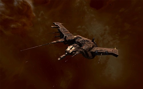
For the last week I have been playing a bit and my first thoughts on the Graphics Upgrade seems to be right, the new graphics dont really add much to the gameplay is probably geared towards new players and making a good impression on them. Though the Drone Parasites (the ones that use the Domi model) look awesome with their tentacles ;). The Drone changes are nice, they now attack in a group and it actually seems to work. Unfortunetely one of the things in the patchnotes, 100 new missions, was a bit of a disappointment. These all seem to be lower level and Mining Mission. The Level 4s so far all were the same as before.
Eve UI
Performance of the Eve client seems to be fine. Even when running two instances. Alt-Tabbing between them is pretty smooth with 2Gb of RAM. What isn’t fine though is the User Interface. The new feature that lets you detach the drone and (new) fleet windows in itself is nice, but where to put them ? And why not incorporate the Fleet Message window in the other fleet window ? I am just flying about with my alt (the whole convert to fleet bla bla thing is already cumbersome) and once the ‘fleet’ is setup I dont really care about these two windows. I ended up putting them on the left side above the chat window. You can’t let it sit where it used to be (down right) because it now also shows up while docked.
Then there is the drone window. Still not very handy to order your drones around, I am sure some UI expert could come up with some thing much better than the right click action menu. But where to put this window ? Tried first to put it upper right next to the overview, but that is ofcourse the space where your targets appear. Upper left wasn’t very practical, that’s where your current system info is, so it ended up under the target next to the overview, leaving my screen very cluttered.
All in all not very practical, and I pity the people that do not play Eve on a widescreen monitor. How do they handle all the various windows ? I am glad I got a 19″ widescreen monitor, even 1280×1024 would not be enough I think. CCP should have also invested some time / money in making the UI of Eve a lot better. This would also be nice for the new players that might want to check Eve out. What we have now, is shiny new graphics and a very cumbersome, outdated UI, that sort of works if you have been playing for a while, but is very hard to grasp if you just start out.
Links:
A Forum Thread suggesting a better UI from early 2007.
Blog about UI + screenshots

From your entry it seems you missed out on one nice thing about the drone changes: you can add shortcut commands for them in the options.
Just thought I’d throw it out there.
Oh that’s very nice, thanks for the tip, hadn’t figured that out myself tbh ;).